Responsive Design
What is Responsive Design?
What is Responsive Design?
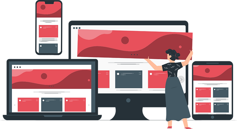
Responsive design is an approach to web design in which the interface adapts to the device's layout, facilitating usability, navigation, and information seeking.
Responsive web design refers to a web design approach that enables your website content to "respond" to and adapt to the screen and window sizes of its accessed devices. Responsive design websites will morph, as required, to appear flawlessly on the end-user's device, regardless of screen size and orientation.
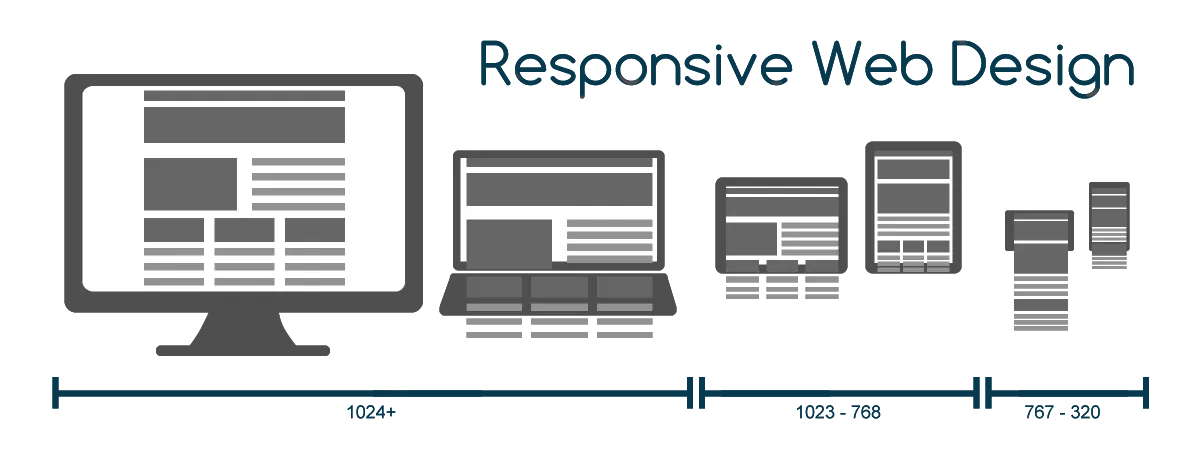
For example, columns of content in a horizontal layout look great on desktop and laptop screens, but they're impractical on mobile phones or smaller tablets, leading to content distortion and readability issues. Responsive web design addresses this by:
- Restricting content columns to larger screens
- Reorganizing content for a mobile-friendly layout on smaller screens
- Leveraging flexible grids, layouts, images, and CSS media queries
- Providing a seamless and automatic transition between devices
Benefits of Responsive Design:
- Expanded audience reach, catering to the increasing number of mobile device users
- Efficiency in design and development efforts as only one version needs to be created
- Improved SEO performance, as search engines favor mobile-friendly websites in search rankings
- Consistent brand presentation across devices
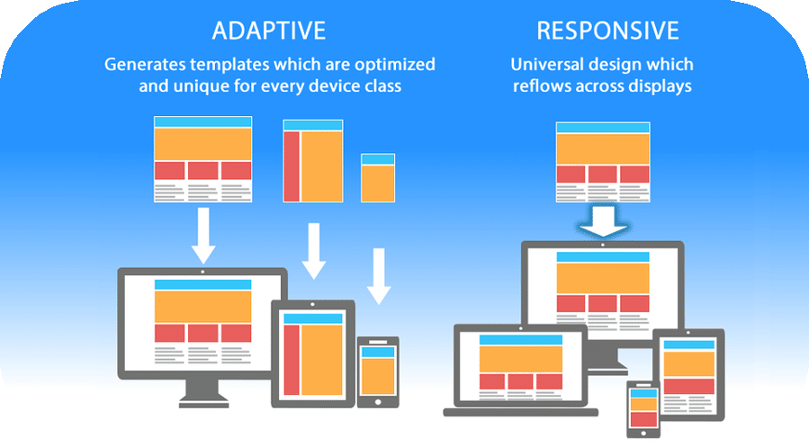
Responsive vs Adaptive
Responsive Web Design vs. Adaptive Design:
The distinction between responsive design and adaptive design is pivotal. Responsive design adapts a single page version to fit various screen sizes, allowing it to respond to the user's device. In contrast, adaptive design creates multiple distinct versions of the same page, each tailored to specific devices.
Responsive design and adaptive design each offer a unique set of advantages and disadvantages.
Responsive Design:
Pros:
-
👍Adapts to Any Device:Responsive design is highly flexible, ensuring that a single design can adapt to various screen sizes and orientations, making it a cost-effective solution.
-
👍Better SEO Performance:Search engines favor mobile-friendly websites, and responsive designs often lead to better search engine rankings.
-
👍Consistency Across Devices:Offers a consistent brand presentation, as there's no need to modify guidelines to fit different design boxes.
Cons:
-
👎Limited Control:Since a single design must cater to multiple devices, designers have less control over how content appears on each screen.
-
👎Potential for Performance Issues:Complex responsive designs may lead to longer loading times, affecting user experience.
Adaptive Design:
Pros:
-
👍Highly Targeted:Provides the ability to create tailored designs for specific devices, ensuring the best possible user experience on each.
-
👍Optimal Performance:Optimizes performance by tailoring content for the device, potentially resulting in faster load times.
-
👍Enhanced User Experience:Customized designs can lead to a more intuitive and user-friendly interface.
Cons:
-
👎Increased Development Time:Building and maintaining multiple versions of a website can be time-consuming and costly.
-
👎Maintenance Challenges:Updates and changes need to be applied to each version separately, potentially causing inconsistencies.
-
👎SEO Challenges:Search engines might penalize sites that don't offer a consistent experience across devices.
Choosing between responsive and adaptive design depends on your specific goals, resources, and priorities. Responsive design is often favored for its cost-effectiveness and SEO benefits, while adaptive design offers a more tailored approach to user experience.
Responsive Steps
Why Responsive Design is Popular:
In the early 2010s, the rise in mobile device usage prompted designers to address a fundamental shift in web access patterns. To accommodate this shift, two main design approaches emerged:
- Crafting multiple versions optimized for different devices with fixed dimensions (adaptive design)
- Developing a single flexible design that could adjust to any screen size (responsive design)
Organizations and designers overwhelmingly embraced responsive design for several compelling reasons. Instead of working with rigid dimensions (e.g., pixels) across various versions, responsive design enabled content to flow fluidly, adapting to the screen it was displayed on.
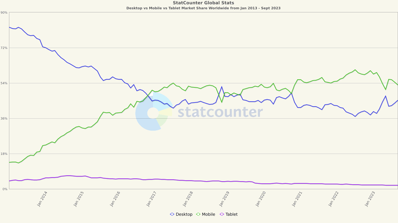
Mobile Dominance in 2023
Mobile Dominance in 2023:
In mid-2023, mobile phones accounted for 55.87% of website traffic worldwide. This trend was even more pronounced in specific regions:
➺
Africa:
74.34%
➺
Asia:
68.07%
➺
North America:
65.62%.
➺
Europe:
53.52%
Even within these regions, there were variations:
➺
USA:
30.61%
➺
UK:
50.67%
➺
Germany:
47.09%
➺
Israel:
62.85%
With the continuous growth in mobile device usage, ensuring a seamless user experience on smaller screens became imperative. This extends beyond cell phones to laptops, hand-held tablets, and smartwatches, each with distinct screen sizes and image resolutions. Failing to implement responsive web design can result in a great user experience on some devices and complete breakdown on others.
Our Commitment to Responsive Design:
Our professional website designers prioritize responsive design to guarantee an exceptional and streamlined user experience across all devices. By investing in responsive web design, you enhance your chances of ranking well on search engines and spare your users the frustration of website redirects. Responsive design is essential to ensuring your brand is presented as intended to every user, regardless of their chosen device.